

The museum's permanent exhibition, Designer User Maker, gives a good recount of the evolution of design, broken into the perspectives of first the designer, then the user, and then the maker. Rather than being organized around design movements across time, the exhibit is structured around breakthroughs in materials and manufacturing techniques. However, it does include a good deal of discussion of how such developments influenced congruent design movements, and highlights designers that were pivotal in shaping the evolution of design philosophies, whether by introducing new methods, materials, or perspectives.
The exhibit began with a chronological timeline of major milestones in the school of design, giving visitors both a preview and an outline of all that they are about to see .It then moves to the perspective of the designer, in its simples form of one looking to solve a problem. Two examples explored are making the NYC subway map easier to interpret, and road signage more intuitive. As the exhibit moved to the perspective of the user, the concept of user-driven design was introduced, as well as a the dilemma of whether design should focus purely on function, or incorporate non-practical elements in an effort to enhance the users’ experience.
As a segue into the maker's perspective, there was a discussion of advancements in manufacturing techniques that allowed lower prices, making things more widely available, and facing consumers with the decision to buy something cheap and expendable, or pay more for something with longevity, or an associated prestige.
In the maker's section, it further explored the latest advancements in design, product development, and prototyping, such as 3D printing and crowdfunding, as well as recent considerations that are being incorporated into design, such as minimizing environmental and social impacts.
While the museum itself is not a furniture museum, many of the concepts discussed used furniture as an example.

This chair was used as an example of industrial manufacturing. Designed by Michael Thonet in 1859, this "Café Chair" is one of the first mass-produced pieces of furniture. Thonet aimed to reduce manufacturing costs by producing the as many chairs as possible with the fewest amount of parts. Consisting of 6 pieces of wood, 10 screws, 2 washers and 1 sheet of wicker, this chair could be packed in a crate and assembled at its final location.
Until this time, most chairs had been made by hand. Thonet experimented with designing a chair for mass production by gluing together wood laminations, but it proved to be too costly and complicated. As a solution, he developed what is now known as "steam bending", where wood is softened with steam and then strapped or clamped over a mold until it holds it's shape.
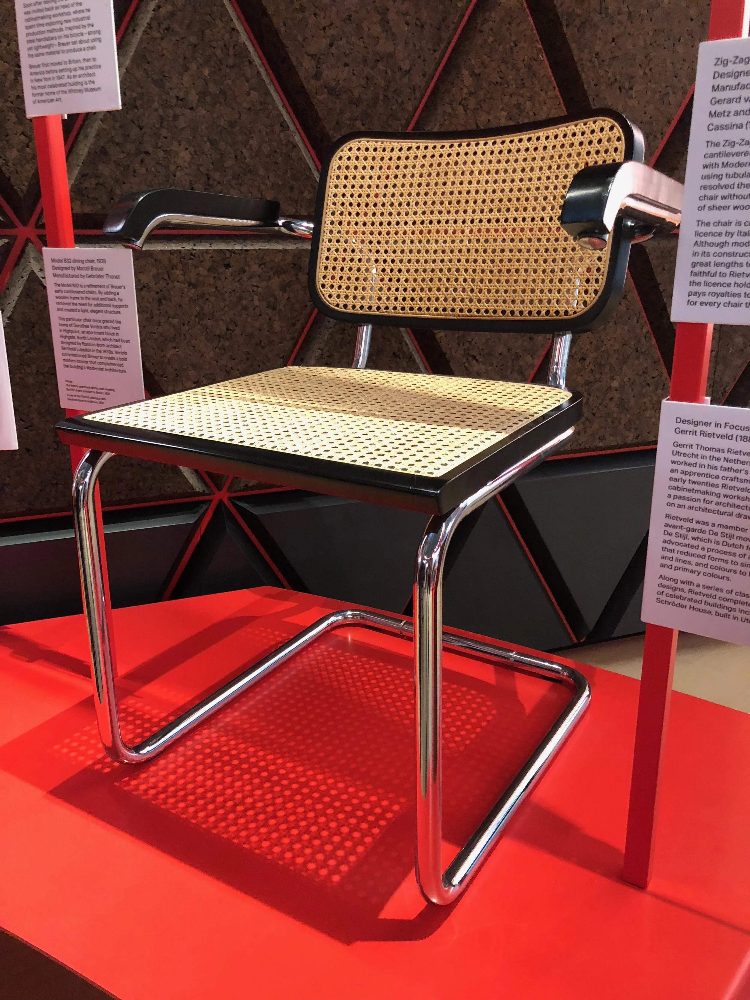
This cantilever chair, a design most frequently credited to Marcel Brueur, exemplifies new industrial production methods by utilizing steel tubing. Brueur use of the material was inspired by the handlebars on his bicycle.

This Zig-Zag Chair, designed by Gerrit Rietveld, was inspired by Brueur's earlier cantilevered chair design, which became popular among Modernist designers for its minimalist approach that used fewer elements than conventional four-legged chairs. This variation accomplishes that using sheer planes of wood, rather that the steel tubing of Brueur's design.

Designed by Frank Gehry, this Wiggle Chair, made of corrugated cardboard, is an example of alternative material use which also plays into the theme of increased affordability without necessarily sacrificing luxury.

This Palace Chair, designed by George Snowden, the co-founder of the iconic furniture collective Memphis, is used to illustrate the eventual rejection of functional, minimalist design philosophy with its intense color scheme and rectilinear shapes.


These fiberglass chair seats were designed by husband and wife Charles and Ray Eames for a low-cost furniture competition held by New York's Museum of Modern Art, in 1948. These chairs pioneered the use of fiberglass in furniture making, introducing a new lightweight, low-cost, and customizable material. The accompanying variations of the Eifel bases were a rejection of the Modernist notions of minimalism as perfection, and one optimized solution fits all.


This collection of iconic chairs designs demonstrates how the same goal can be achieved through a variety of forms and materials, all with equal success.

The 3D-printed 'Chubby Chair', designed by Dirk Vander Kooij, is the first example of commercial plastic furniture not made with injection molding. It also illustrates new environmental considerations that are being incorporated into design, as it is made from recycled interior components of discarded refrigerators.


Designed by Assa Ashuach, the 3D-printed 'Femur Stool' is an example of data-driven digital design. An algorithm that uses the weight and proportions of the individual user determines the form, and any material that not crucial to structural integrity is removed.

The 'Superleggara Chair' designed by Gio Ponti in 1957 is meant to resemble a more traditional style of Italian chair, but with a more lightweight, compact and low-cost design. This was achieved by using legs and struts that are triangular in shape, rather than round, thus significantly reducing non-essential material
The museum itself is an exemplification of good design, with its thoughtful layout, the flow of the visitor experience, and the architecture. Not one aspect seems to lack consideration, right down to the small ear-speakers featured at some displays for audio, which seemed to have been designed in a way that successfully encourages people to put them back in their magnetic holder, rather than leave them hanging by the cord.

Perhaps unexpectedly, my favorite part of the whole museum is the restroom.
The urinals are design addresses two major problems that exists with just about every other comparable fixture that I have used: deflection of the stream of liquid back towards its source, and the puddles that develop in front of the urinal.

The shape of the bowl seems to be designed with an eye towards hydro dynamics, which gently directs liquid down the drain, with virtually no "splash back". The angle of the fixture relative to the floor and user encourages all but small children to stand at a distance that avoids the occurrence puddles.
The engaging and eye-catching design of the sinks, soap dispensers, and hand dryers entice users to then wash their hands before exiting.

To prevent the all-too-common experience of finding an empty soap dispenser, a 'Refill' light on the mirror indicates when the dispenser is empty.

Finally, and perhaps the most brilliant part, the door handle spans a distance roughly from eye-level to knee-level, which I determined could only be so that those like myself, who loathe to touch the door handle on the way out, can open the door with their foot. I wish that all public restrooms would include, at the very least, this particular feature.

(This is the outside of the door, but it's the same handle inside.)